An evolution of the filter experience.
The challenge
Propose an evolution of the filter experience.
The approach
To accomplish this challenge, I did an extensive research about trivago´s mobile and desktop website learning everything I could about its functionalities and capabilities.
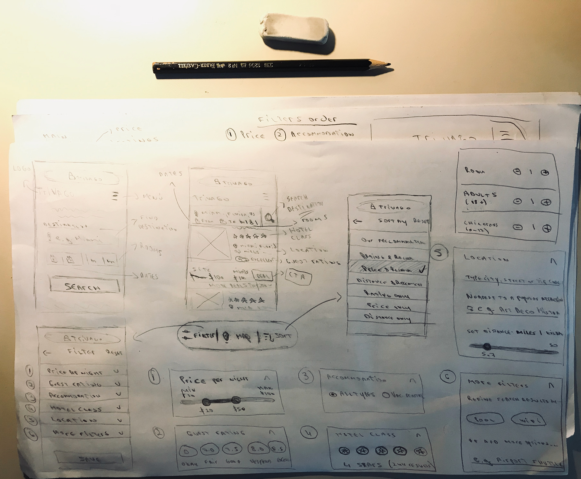
Sketching out ideas for mobile website
I began doing some conceptual designs on paper in home screen. These changes will affect how search inputs will be displayed in the next step of the user flow and will give you a better idea of the improvements that i did in the user experience.
Information arquitecture (IA)
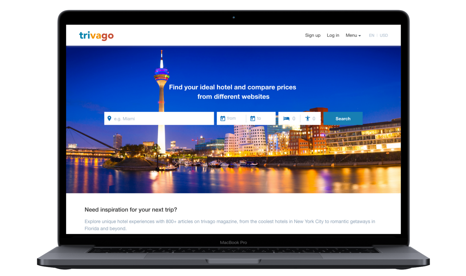
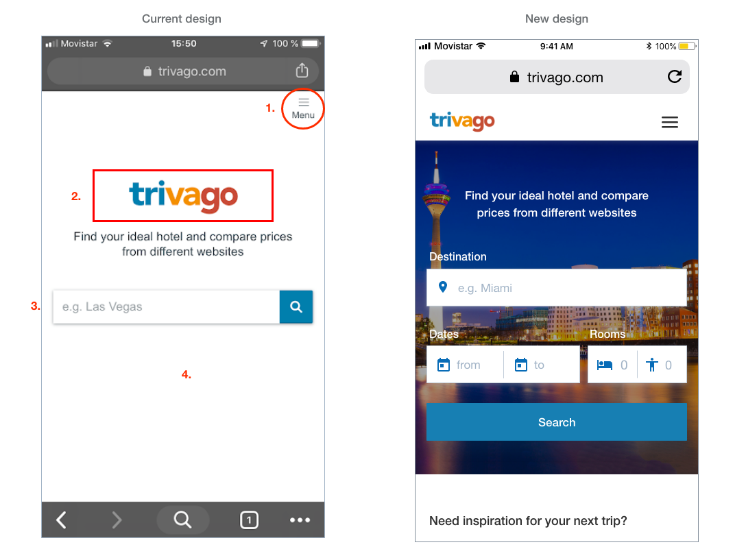
Home Screen
Changes in this section:
1. I removed the text "Menu" below the icon.
1. I removed the text "Menu" below the icon.
2. I moved Trivago´s logo to the top bar, to gain space on the screen and show more search options to the user.
3. User can search by destination, dates and also by room guests.
4. Beautiful image background of DÜSSELDOR, location of Trivago headquarter offices. We are visual creatures, and images can be a powerful way to capture users’ attention and communicate your message.
Hotel Listing
1. By reducing search input information at the top and moving filter options to the botton, I gain extra screen space and I give the user more visibility to find hotel deals.
2. Hotel listing gain more visibility (+16%) giving the user more possibilities to find the best offers.
3. Hotel photos are 22% bigger (great to increase user engagement).
4. Showing discounts to the user.
5. By reducing extra information, I give more visibility to the most outstanding offer. If the user wants to see more related offers, can see them with just one click.
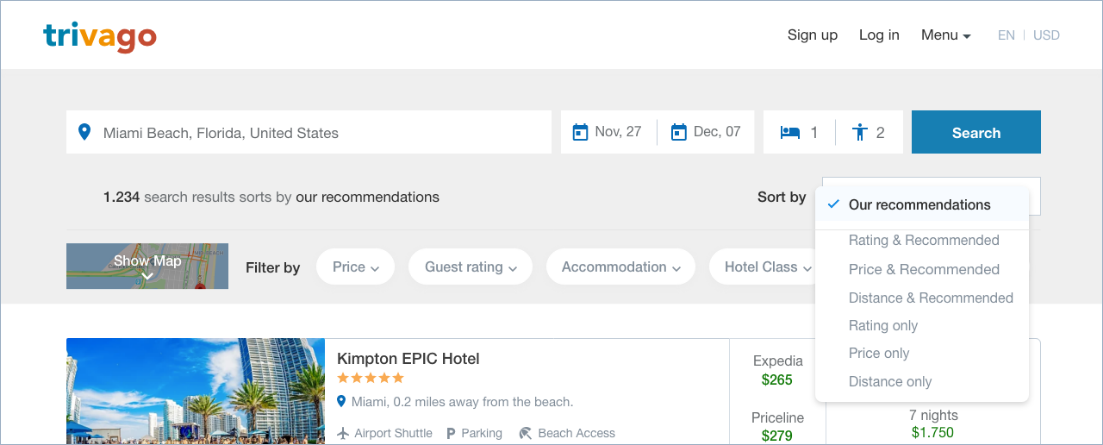
Filters, Map and Sort
I moved this options to the bottom of the screen. If the user scroll down, this options are in a fixed position and is really easy to access if the user needs to use them.
I moved this options to the bottom of the screen. If the user scroll down, this options are in a fixed position and is really easy to access if the user needs to use them.
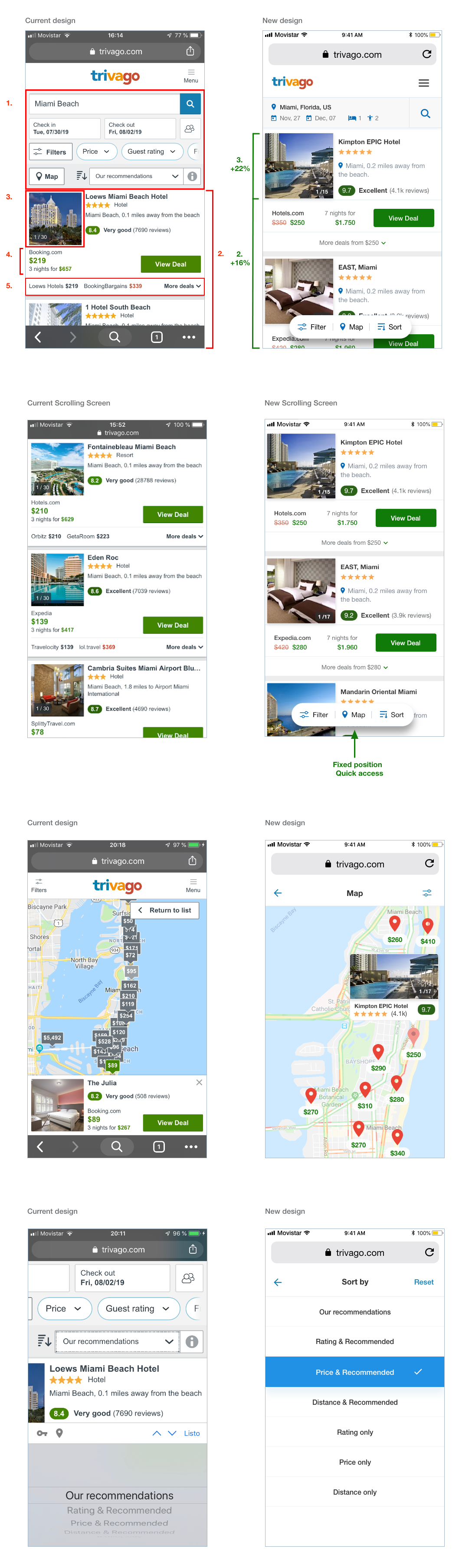
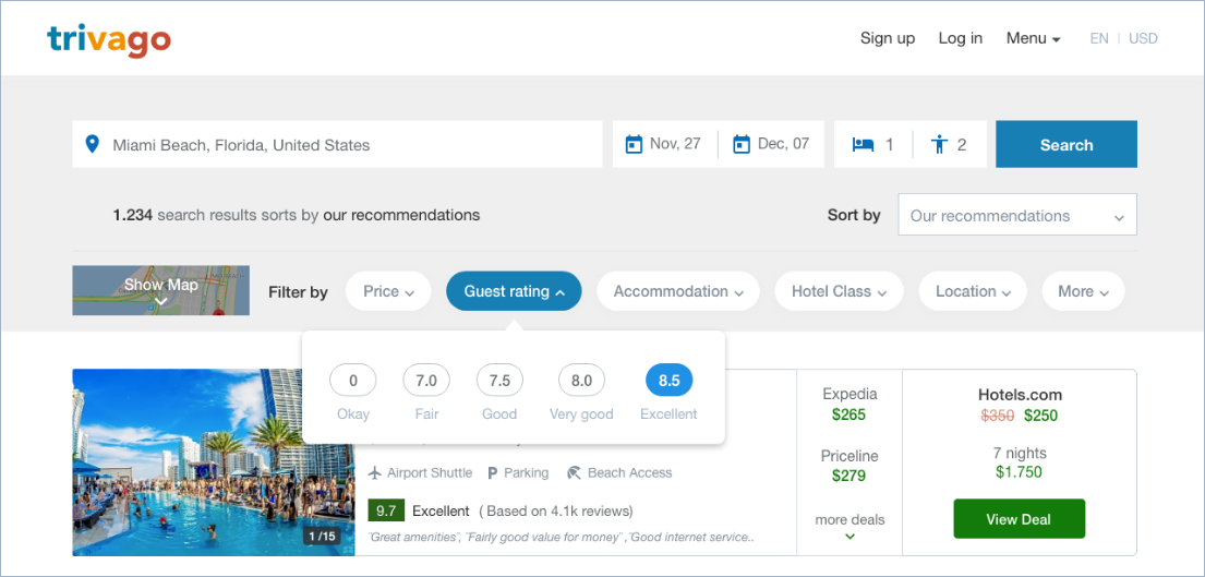
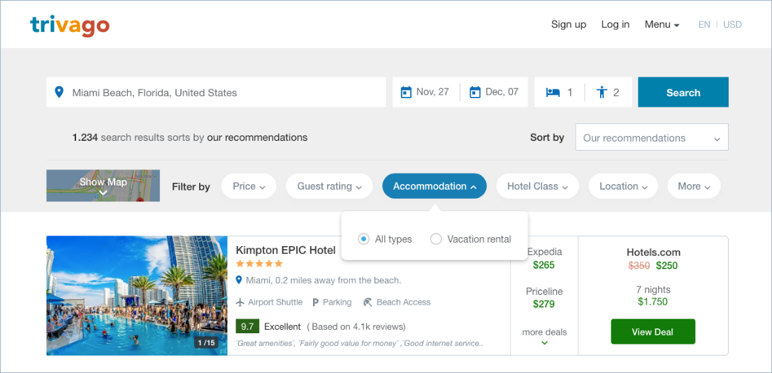
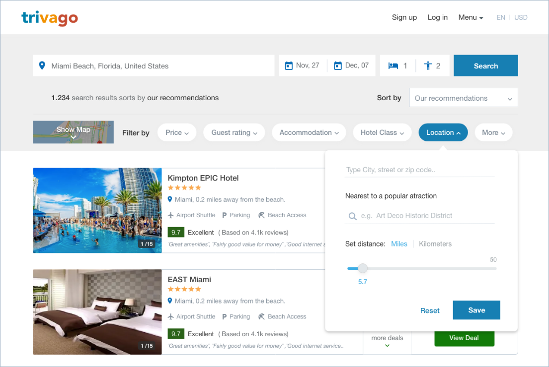
Filters
In this section, I modified the way that filters are displayed (from a expanded version to a collapse version), so, the user can see all the filter options available without the need to scroll down the screen.
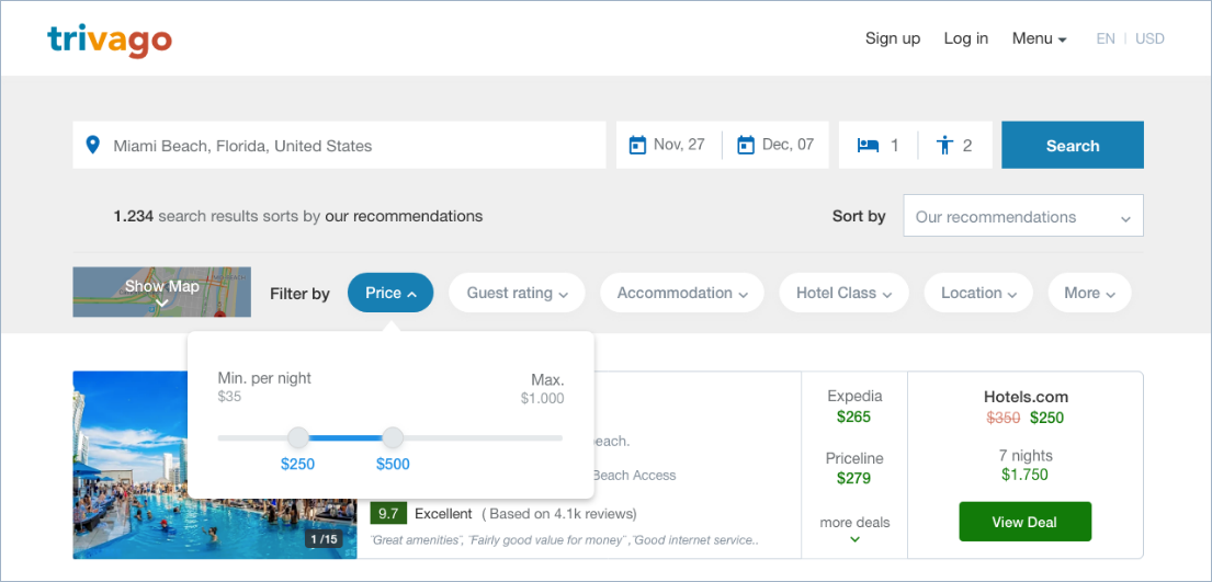
Price per night
Select from a minimum price range to a maximum.
Guest Rating
Easily see what each valuation means.
Accommodation
It can be easily selected between one option or another.
Hotel Class
Simple selection of the hotel class by clicking stars.
Also, the user could see the number of hotels available in that category.
Location
Search by city, street or zip code. Also, it's possible to search hotel near a popular attraction or by setting a distance from it in kilometers or miles.
More filters
Concepts search are easily to select or to add new ones.

Prototype
Desktop website
Sketches

High-fidelity wireframes
Let´s look now in a desktop website all the ux/ui changes that I made before.
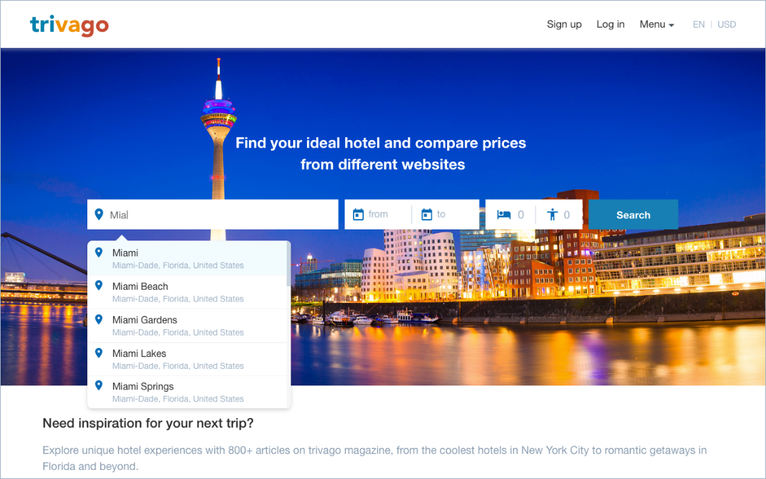
Search results screen

Filters


Desktop prototype